Wednesday, 18 December 2013

Packaging Design: Final Pieces


The image below shows my final net for the packaging design module. I was quite pleased with the outcome, the net on the right shows the interior which would be stuck inside of the box whilst the black and white design on the right is for the exterior of the box.
I'm pleased that I went for a shape which was slightly off a normal rectangle, I think that added a bit more interest to it just being a regular shaped box to go with the brief. I also wanted the exterior of the box to be kept quite simple like the logo of the company so that I'd stay within the whole feel of the brand. However I wanted the inside of the box to be bold and colourful, something the customer would experience when opening the package. Each product would have a different colour between red blue and yellow.

I am quite pleased with the outcome of my packaging design however I do feel that I could have pushed this a lot more. I felt quite held back by the brief because the identity and website of the company was so specific, I feel like there was no real opportunity to push the boat out and experiment with design. However on a positive note I do feel that this is good experience with working with a client! 


Thursday, 21 November 2013

Packaging Design: Fashion Research

Although for the Packaging research task we had to look at a lot of different fields and categories of packaging, after being delivered the brief I decided to have a look at more packaging which would be more specific to the brief, which is to come up with a packaging solution for underwear for BOX clothing.


I think this is an interested way to package a box away from the traditional rectangle shape, the pentagon adds a lot more interest to the box itself. Although the company we're completing the brief for is called 'BOX' there could be an opportunity to stay away from that normal shape. 


I like how simple this packaging design is, it's very modern and fresh and I think is successful in packaging different garments as each box has a different size specification with different icons according to the product inside. The use of icon is definitely something I should consider in my designs as it's a great way to differentiate the products.


I love how this packaging design is purely based on using white. It looks so fresh and clean and I definitely think it reflects the very scandanavian style of design which Nordic House has. I love how modern and sleek this looks, you definitely get the impression that it's an upmarket company.


I thought I'd include this one as I thought it was a good example of putting more than one product into a packaging solution. I could have different sections or smaller boxes to go inside a larger box depending on the different products.


I love how elegant this design looks, the black box looks very luxurious especially with the small white text which contrasts hugely. I also love the tissue paper, I could possibly look into creating a pattern to go onto tissue paper for my design, it could be decorated with different icons or perhaps even the BOX logo.

Wednesday, 20 November 2013

Packaging: Research Task

After handing in our Digital Skills Acquisition, we were given two weeks to put together a presentation showing different examples of packaging design with no specific category - all fields should be covered. I found so many different interesting examples which I will post my favourites here - mostly sourced from Pinterest so if you'd like to see more please check out my packaging board which is here!


Tuesday, 19 November 2013

Packaging Design: The Brief

Today we were introduced to our second project of the year, packaging design. We had the opportunity to complete a research task of putting together a presentation showing innovative packaging design so that we could see for ourselves just how creative this field of graphic design could be.

Our brief for this project is once again a live brief, which I think is good experience as we're working for an actual client who has specific needs and desires for what they want, which I think is good for getting prepared for industry.

THE BRIEF
The client is BOX  - Men's apparel, and has been set by MONOGRAM London.
BOX is an Internet-based men's fashion brand focused on driving a fundamental shift in the way men purchase their essentials (underwear, socks and undershirts). The products will be sold to consumers via rich web experience, which is not yet live, however during the briefing we have had the opportunity to see shots of the website and their logo, which have helped to give us a feel of what the company's style is like.

We are required to design and develop a range of packaging for the BOX brand products. The full range of products needs to have the following information across all packaging routes and will be communicated for each as follows: Product name, sizes S,M,L,XL, colours, grey, black, white. We must consider that all packaging must be designed with postage in mind, but must maintain a high-end rich brand quality feel for the end user and brand experience.

SWAT Analysis
STRENGTHS - I have completed quite a lot of research set by the research task so I feel quite prepared for this  brief, (you can see a lot of it on my Pinterest board here
WEAKNESSES - I've never completed a packaging design before so this is completely new to me!
OPPORTUNITIES - I feel I can gain some useful experience from this brief, especially with it being so restrictive as this is what it will be like working in the industry with client's having specific 'wants' for a design.
THREATS - There are quite a lot of restrictions and things to consider for this live brief, and the BOX identity is quite simple with a mainly black and white colour scheme so I feel quite worried that I can't be very innovative with my design.

TIME PLAN:


Friday, 25 October 2013

Digital Skills: Final Pieces

I've successfully handed in my first project of the year - Digital Skills Acquisition! 


This TIFF image shows my final stationary design for the Instant Print gardening category. I'm really pleased with how these have turned out, I especially like how successful my artwork has turned out on the flyer, if I was to improve I would possibly edit the background colour to a different shade of green so it stands out from the colours on the art work a bit more, I'd also possibly edit the text so a slightly larger font and perhaps try it in white, as I don't think the black text looks 100% effective. 
I'm also really pleased with how my business card designs have turned out, I remained consistent by using Bebas which I also used on the flyer design. I think the white background gives the illusion of white spice and the small icons has quite a modern look to it. I also wanted to include the artwork on the business cards to so that as a set, they went together well.

Wednesday, 16 October 2013

Digital Skills: Developed Ideas

I feel like a lot of my digital skills have developed when putting together the artwork for the gardening stationery category. I used Adobe illustrator to play with different brushes and effects to come up with this leaf/grass effect which is seen in the picture below

After playing around changing the colour of the plastic flower I photographed in Adobe Photoshop, I started playing around with different layouts and also adding in the grass effect behind the flowers which I really liked the effect of...


I then started to add 'rain drop' effects by adding circles, triangles and rounded rectangles and amending their shapes until I got the desired effect. I also added some flower motifs in a vector style which I think contrasted nicely with the photographed flower.

FINAL ARTWORK:
This is the final artwork which I will consider for use on flyers and business card designs. I'm really pleased with how it's turned out and I would also like to experiment using different coloured backgrounds, especially with the summery/pastel colour scheme of the artwork!

We also had a group presentation this week where we had to show the group our initial and developed ideas and basically what we had come up with so far. I was really pleased with the feedback I had been given - especially since Allah the girl from IntantPrint was there to give us her opinion directly which was a great help - she told me my designs were looking on the right track and to keep going which was very encouraging, especially hearing it from someone you're working a brief for!


Tuesday, 8 October 2013

Digital Skills: Initial Ideas

After taking photographs I felt a lot more inspired about this project, so I finally felt like I was able to come up with some initial ideas which I started to sketch out on paper - I think it's important to begin initial ideas on paper or in a sketchbook rather than jump straight onto a computer without any idea of what you're going to do! 


With these rough scamps I can now progress onto moving onto the computer to put these together in a more realised manner!

Saturday, 5 October 2013

Digital Skills: Taking Photos

For the InstantPrint live brief I had chosen Gardening as my chosen category to design some stationary for. I took this opportunity to take some photos of a fake flower in the front window, and some plants in the back garden as well as some of my dad's gardening tools I could use to start developing some art work!


The next step after taking these pictures is to start coming up with some designs and initial ideas, I'm also hopefully going to be able to use these pictures to come up with some design work, perhaps by using the pen tool to go over the shapes so I can have a good play about with them. I'm hoping this will be very beneficial in terms of the development of my digital skills!

Wednesday, 18 September 2013

Digital Skills: The Brief

The first project of this year is Digital Skills Acquisition, we've been set a live brief as well as different digital skills tasks which need to be carried out weekly, which will help to develop our computer skills in weekly tutorials and sessions carried out by our tutor.

THE LIVE BRIEF
The live brief aspect of this project has been set by a company called Instant Print, where consumers can use their website to put together business cards, flyers and other stationary using the templates provided, with the opportunity to customise them. Our task is to design a potential template for a chosen category of our choice. However there are some restrictions to consider...

  • Each document must have 2 layers, 1 for the background and elements which can't be edited such as illustrations, the background colour and shapes.
  • The second layer is for editable elements such as the text, shapes and other elements
  • Text can only be set at even font sizes, and it can not be smaller than 8pt.
  • All text must be placed on layer 2
  • Only one font size or colour can be used in each text box.
  • The only colours to be used are the ones provided on the palette in the brief document
  • The only fonts to be used are the ones specified in the brief document.

SWOT Analysis
STRENGTHS: I'm looking forward to putting together some initial ideas for this brief, which I have yet to chose a category for. I also feel that I'm quite confident in putting together stationery design layouts, especially business cards.
WEAKNESSES: I don't really feel very confident about my current digital skills, however with the I.T sessions this should change over the course of the project. I also feel that the live brief is quite vague picking any category!
OPPORTUNITIES: In this project there's a huge opportunity for my digital skills to be developed more, which is definitely useful for progression. Attending all I.T sessions and completing all digital tasks set is very important in this module.
THREATS: I feel the threats for this project are the restrictions set in the live brief, as there's a list of fonts to choose from so the design I eventually come up with will have to cater for this. The colours may also be a potential threat however it does depend on how my designs turn out.

TIME PLAN:


Tuesday, 17 September 2013

Hello 2nd Year!

As it's the beginning of the year, I'm going to set myself some goals from what I want to gain this year and where'd I actually like to end up in terms of what I'm doing!

I feel as though I need to focus this year on my studies, and the possibility of hopefully gaining a placement will additionally help me gain a bit of insight and experience into the industry, although I will have to be careful if the opportunity arises that I balance my workload with placement work so I don't get behind!


In terms of education, the summer will mark the end of my Foundation Degree and I'd really like to continue my studies to top it up to a full degree, as I don't think I'll be ready for industry yet and the Creative Industries top-up course at Newcastle College is all about getting you ready for industry, so that is definitely something I'd consider applying for. This also means I'll have to apply through UCAS again and therefore do a personal statement! 


I'd also like to try and stay as organised as possible this year, by creating time plans at the beginning of each brief in order to make the most of the time I have on each project. I'll also carry out a SWOT analysis on each and possibly targets to set myself in order for progression.

Tuesday, 7 May 2013

Pinterest

Check out my Pinterest and give me a follow! Click here!

I mainly pin things that help to inspire me or just cool things that I see floating around 

Friday, 19 April 2013

Hitchcock Movie Poster

Today is the deadline for the Hitchcock movie poster project and I finally finished my poster for Vertigo using inDesign.


I wanted to try and mix the styles of classic movie posters but still add a modern touch to it, I feel this is done by the simple minimalistic style but I also wanted to use quite old looking classical fonts for the text to get an older style. 

I also had to incorporate the Tyneside Cinema logo and I had a few problems trying to place it alongside the credit text but I decided to just leave it centered underneath because whenever I put it to the side it looked quite off and unbalanced.

After printing I realised that the credits texts must have been a very light weight because although it translates quite well and is readable onscreen, when I printed the piece off it went all pixelated and faded a bit, meaning you could only read it if you were close up or squinting! So if I were to revisit this project I would do a test print to make sure it came out alright and would modify it to fix it.


Illustration Brief

Today we got the brief for our final project of the year, the illustration brief. I'm actually really looking forward to doing an illustration project as throughout this year I feel like I haven't really been able to add any illustrative elements to my work, purely as it hasn't really been relevant to the other projects.

I'm excited by how the brief sounds, it is to design a cover for the Penguin Book awards from a choice of The Wind in The Willows or The Big Sleep. 

I've decided to choose The Big Sleep, as I think the subject matter will be very interesting to cover, the setting of Los Angeles in the 1930's and the storyline revolving around crime and gambling has a very sinister feel to it which I think will be interesting to explore through illustration!

STRENGTHS: I quite enjoy illustration so I think it will be quite easy to stay focused on this topic.

WEAKNESSES: I don't have much experience transferring illustrations onto the computer and then editing them or going over them so I think that's a weakness!

OPPORTUNITIES: More experience can be gained especially using a computer to illustrate.

THREATS: Time! Illustration can be very time consuming so I think it's important to really consider what to illustrate and to stay completely focused and not get behind!

TIME PLAN:


Wednesday, 27 March 2013

Art Direction

As part of our Hitchcock moving poster project, we had to collaborate with some foundation photography students as the brief states that our poster must be photography based. As well as me there were also 3 of my classmates doing Vertigo so we had to get in touch with our photography students, and there was a bit of a problem trying to schedule a meeting and photoshoot because there was so many of us in the group with conflicting schedules.

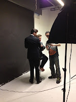
The task included having to art direct a photoshoot, something I'd never done before but it sounded interesting! Our group got the chance to assist in the photography studio when the first half of the class was doing their photoshoots so we got to watch what was going on and get a first taste of what happens. A lot of time was dedicated to setting the scene up, setting the lightening, getting the styling right etc, and the art director plays a very big role in deciding whats happening in order to get the right shot, so a lot of planning was needed.

The day came for our photoshoot and it was a very long but productive day in the studio with models reenacting the characters from Vertigo, although we did have to change who our male model was halfway through!

setting up and test shots


reenacting the characters


reenacting the James Stewart hanging scene


Art directing was a very new and interesting experience, it gave me a bit of insight as to what it's like working in industry.