Wednesday, 27 March 2013

Art Direction

As part of our Hitchcock moving poster project, we had to collaborate with some foundation photography students as the brief states that our poster must be photography based. As well as me there were also 3 of my classmates doing Vertigo so we had to get in touch with our photography students, and there was a bit of a problem trying to schedule a meeting and photoshoot because there was so many of us in the group with conflicting schedules.

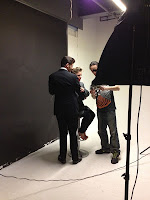
The task included having to art direct a photoshoot, something I'd never done before but it sounded interesting! Our group got the chance to assist in the photography studio when the first half of the class was doing their photoshoots so we got to watch what was going on and get a first taste of what happens. A lot of time was dedicated to setting the scene up, setting the lightening, getting the styling right etc, and the art director plays a very big role in deciding whats happening in order to get the right shot, so a lot of planning was needed.

The day came for our photoshoot and it was a very long but productive day in the studio with models reenacting the characters from Vertigo, although we did have to change who our male model was halfway through!

setting up and test shots


reenacting the characters


reenacting the James Stewart hanging scene


Art directing was a very new and interesting experience, it gave me a bit of insight as to what it's like working in industry.


Wednesday, 20 March 2013

Cute Packaging

I was on a pinning spree the other day (once you start you can't stop!) and I found some really cool packaging design ideas. Although there's no packaging design project this year I think the designs are great and could possibly help to inspire me with future work.


MOR COSMETICS: I really love how pretty this packaging is! It looks really cute and the colours are quite soft and feminine. I also really like the patterened fan shapes on the packaging boxes with the different colours, it's very striking and I like how different textures have also been incorporated. 


LADUREE PARIS: Like the previous example this has a very soft and feminine look to it. The intricate design around the 'Laduree' looks very elegant and I love the white crocheted detail, it contrasts in a soft way to the pastel blue colour and has a very clean look to it.


PIETRO GALA LINGUINI: I thought this was a very unusual and innovate way to package pasta, as when you normally look around the shops the packaging looks very boring. I love how they've incorporated an illustration into the packaging and it interacts really well with it. I like how it doesn't need any colour to look interesting.


KOCO: I love how fun this design is! I think it really appeals to the market because it's quite cheeky but also has a friendly vibe too. I like how simple and minimalistic the design looks aswell, and there's only a slight touch of colour which adds some interest, but the contrast with the black and white is the most striking.


Friday, 15 March 2013

Helvetica Movie

We recently watched a film called Helvetica in class, a documentary about the font and how people have different opinions on it. It's basically displayed on every street sign in New York, so it's constantly being seen around. Some people don't like the simplicity of it and think it's boring, but others think the simplicity and legibility is whats great about it. 

I also saw this on Pinterest and thought it was pretty relevant:


A nice cheesy typography joke

Sunday, 10 March 2013

NYC - MoMA

We only had an hour to run around the Museum of Modern Art but I think we did a pretty good job!


In the photopgraphy section I couldn't believe it when I saw an exhibition showing pictures from Jarrow my hometown! All the way to New York and I still can't escape the place...


It was also really great to see huge artworks by the likes of Picasso, Monet and Andy Warhol in the flesh! You read about them for research and stuff but it's completely different getting to see their work properly!

Jasper Johns

Andy Warhol

Andy Warhol

Rene Magritte

Claude Monet

Claude Monet

Pablo Picasso


I also bought a book about Vahram Muratyan's illustrations of Paris vs New York in the gift shop. I blogged about this way back in November so I was pretty excited when I saw the book so I had to buy it! Check out the earlier blog post here too


Saturday, 9 March 2013

NYC - Agency Visits

The main purpose of our trip to New York was to visit a couple of creative agencies, which were Pearlfisher and Droga5!


PEARLFISHER


Overall there was a really friendly environment at Pearlfisher, the staff were really nice and welcoming and they were very enthusiastic talking to us about what Pearlfisher does and the work they've produced and what they do for the design agency.

'We  are designers. We believe. We create.' is their approach to design, and they really believe in the power that design can have and how passionate they were about it. 

They showed us some really interesting case studies including the packaging work they did for Marcobar. The brand is all about the idea of eating well and providing natural food, they wanted their designs to include combined illustrations in order to get the feeling of different experiences from the food.


They also showed us some packaging work they did for the Starbucks coffee packaging, by designing them in a way so that customers could easily recognise their favourites and explore new blends. They have a very simple design which is so that the packaging is easy to navigate and they seem more accessible.

A day or two later when getting breakfast from Starbucks we actually spotted some of these designs too!


DROGA5

Droga5 was the second agency we visited, and I think as a group we all felt a sense of Geordie pride as Droga5 are responsible for the advertising of Newcastle Brown Ale in the USA, which actually seems very popular over there in comparison to how popular it is at home.

Their campaign for Brown Ale is really good and funny, it revolves around the saying 'No Bollocks' and they actually get involved with Facebook to encourage 'likers' to send in their idea of 'No Bollocks' photographs. Their advertisements are quite cheeky but I really love it! They did a response advertisement to Stella Artois' 'chalice' campaign and tied it in with their 'No Bollocks':


They also gave us a quick tour of the agency and they had a really cool rec room which of course served Newcastle Brown Ale!



NEW YORK CITY!

I had the incredible opportunity to visit New York City with my class from the 4th - 7th March. I've wanted to go to New York for years and it certainly didn't disappoint!

We visited two creative agencies, PearlFisher and Droga5 which were great experiences and they looked like really cool places to work!

We also walked so much, trying to cram in all the sights and things to do, I want to be back now!!